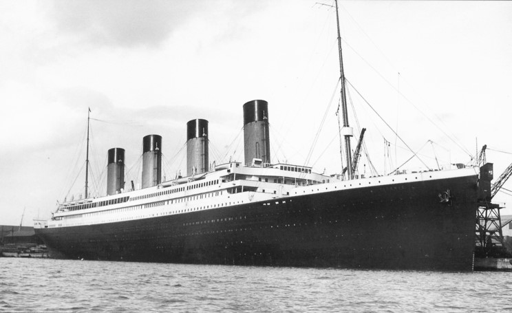
Color Guide

This color guide is included here for the modeler.  Although color photography existed during the time of the Olympic class ships, there are no known color photos of any of these ships.   The only exception is a long distance color photo which included Olympic in 1928.  The value of this particular photo is limited.   This has caused endless debate about the shades of the various colors found on these ships.  This guide is not meant to be an academic treatise on the colors.  There have been examinations of the colors which have probably narrowed the range of probable shades of the various colors.  Even after the best analysis of the colors has been done, there is still a component of subjectivity in almost all of the colors.  I have seen most of the suggested shades for the various colors.  I have read detailed analyses and rationales for different shades. After all of that I have decided which shades I believe are closest to those which appeared on the actual ships.  I make no claim that these are “the” shades of the colors.  These are the colors I would use if I were building a model today.

One might ask: Where did these particular shades come from?  Almost every shade in my chart was sampled from either color photos of the particular item or from the BS381C color chart.  Several of the colors used on the Olympic class were also used by shipping lines which continued into the era when color photography was widely used.  These are the particular colors which I sampled directly from photos of these ships.  The BS381C chart was a collection of commonly used colors in the early part of the 20th century.  So these colors didn’t come out of thin air but are sampled from sources thought to be the closest to the actual colors.   Important Note:  When viewing period black and white photos of the Olympic class ships which appear in these plans, colors which have any red content will appear to be a darker shade than they actually are.  Black and white film of the time caused colors with red content to appear much darker than they actually were.

One aspect of colors used by the modeler which is of importance is the relative gloss or lack of same in these colors.  The simplest guide to these colors would be to make them all flat.  The smaller the scale of the model being built, the more the colors should tend toward “flatness”.   Scales roughly 1/144 or larger are the only ones which I would even consider slightly moving from pure flat to either eggshell or satin finishes.  The experienced modeler will know what to do regarding this issue.  For the less experienced my advice would be that if you are in doubt, go flat.

Main hull, top of funnels, all cargo hatch coamings except #4 (P&S),waterways, rigging, and other structures painted black. This is a black which has faded somewhat. Therefore it is actually a dark gray.

White painted part of hull, deck houses, lifeboat hulls and other structures painted white, #4 cargo hatch coamings. For a good scale appearance, any white should not be too bright but should be toned down with yellow or gray tinting.

AntifouilingRed3

Hull below black portion of hull.  Many model representations of antifouling red are either too red or too brown and are usually too dark.  No matter what the color, people always want samples from Titanic’s wreck.  In the case of antifouling red we do have photographic proof of the color.  It is shown here.  Some may object that it has faded over time.  However, look at other paint on the ship and every color is without exception darker due to accumulation of dirt and other accretions.  That does not appear to be the case on the bronze propeller root which does not show evidence of oxidation.  Propellers: root of wing propeller blades, wing propeller boss and wing propeller fairwater cap.  Center propeller fairwater cap.

Sheer line between hull black and upper hull white, vessel name at bow and vessel name and port name at stern.

Dark-mast-sampled-from-OQWadjusted2016

Masts, well deck dadoes, lifeboat gunwales, and brass framed windows.

WSB 10-16-17

Lower part of funnels 

Light Stone2

Lifeboat interiors

Wood decks are difficult to simulate with paint. At small scales it is very difficult to lay scale wooden decks. For scales smaller than 1/144 I would recommend paint for the decks. For 1/144 scale and larger I would recommend using actual wood for the decks. For a painted deck, this color will give a close approximation of a wooden deck.

Canvas lifeboat covers. This canvas was bleached so it was just off white. Don’t make the mistake of making the canvas appear too yellow or gray or tan.

 Main color of winches, capstans and windlasses aboard Titanic.

Water hydrants

Bridge roof, wingcab roof, officers mess roof, roof over engineers smoke room, elevator gear house roof atop second class entrance aft on Boat Deck, roof over kennels, concrete bases under ventilators, top of electric crane bases

Top of boiler casings (rectangular area under funnels), top of tank room, top of turbine engine casing

Interior of starboard navigational light enclosure on the wingcab

Interior of the port navigational light enclosure on the wingcab


The propellers, whistles and capstan tops were bronze. Since they are bare metal, a metallic paint needs to be used to accurately portray the metal or actual metal parts need to be used in the model.  The propellers also had antifouling paint applied to them.  This is discussed in this article: http://www.titanic-cad-plans.com/wp-content/uploads/2018/12/Propeller-paint.pdf

The drawing below is a guide to where antifouling paint was applied to the propellers.


The various telegraphs were brass. Since they are bare metal, a metallic paint needs to be used to accurately portray the metal or actual metal parts need to be used in the model.


HMHS Britannic

Only the color differences for HMHS Britannic will be given.

In her later career, HMHS Britannic had the Boat Deck deck houses from the handrails to the deck, the sides of the raised roofs and the gantry davits were painted this color. Boat gunwales were this color.  The following photos show how the boat deck deck areas were painted.

Britannic Yellow4

Entire funnel, masts, ventilators atop Boat Deck deck houses, gantry davits early in her career. No sheer stripe on Britannic.

In addition to the structures specified for Olympic and Titanic, the upper hull was white instead of black like Olympic and Titanic.

The broad hull band and the hull band on the 34 ft. motor lifeboats

The red crosses on the hull and on the 34 ft.motor lifeboats.

H.M.T. Olympic (1917-Armistice) Dazzle Camouflage Period

During the period 1917 to the Armistice of WWI His Majesty’s Transport Olympic had two schemes of camouflage known as “dazzle”.  These were camouflage schemes with colors and shapes meant not to hide ships but to make their identification, range, and direction of travel difficult to determine.  I have analyzed all the material I could regarding Olympic’s two camouflage schemes during this period.  Her earliest dazzle camouflage scheme was designated 19A (modified).  It was applied some time in 1917 and remained until some time in 1918.  Her second dazzle camouflage scheme designated 19Ax was applied some time in 1918 and remained through the Armistice.  I found it impossible to determine definitive patterns and colors for these two schemes.  It was possible to determine a close approximation of both schemes but the obstacles were:

1. Drawn patterns did not completely agree with each other.

2. Photos of the patterns did not completely agree with each other.

3. Drawn patterns and photos did not agree with each other.

4. Colors found in some drawn patterns did not agree with colors in others.

The pattern discrepancies were not major.  But they were just enough so that no single definitive pattern could be identified.  Colors varied because of many factors having to do with staining or fading of original documents.   From photos it was clear that some colors faded and wore more quickly than others.  Since there were no color photos with which to compare drawn color schemes to,  shade and brightness were not possible to be determined definitively.

The colors found in each scheme below would be their “as painted” and freshest appearance.  Also painting guides were general and many were not ship specific.  Exact locations of pattern boundaries are difficult to determine and had to be done by photo analysis.  There were many areas of the deck houses where no photo evidence exists.  For these areas I would suggest painting a light blue or light gray from the color palette for that camouflage scheme.   The modeler wishing to model HMT Olympic in one of these schemes should look at photos of H.M.T. Olympic and see how these patterns and colors weathered.  All colors represented here would be quite faded in their weathered appearance.

Note: Below the waterline she was painted antifouling red as shown above for the other ships.

Dazzle Camouflage Scheme 19A (modified)

Port and Starboard Patterns

Olympic Camo192

Color Palette

Pallete 19a

Dazzle Camouflage Scheme 19Ax

Port and Starboard Patterns

Camo19Axcombo

Color Palette

Pallete 19ax